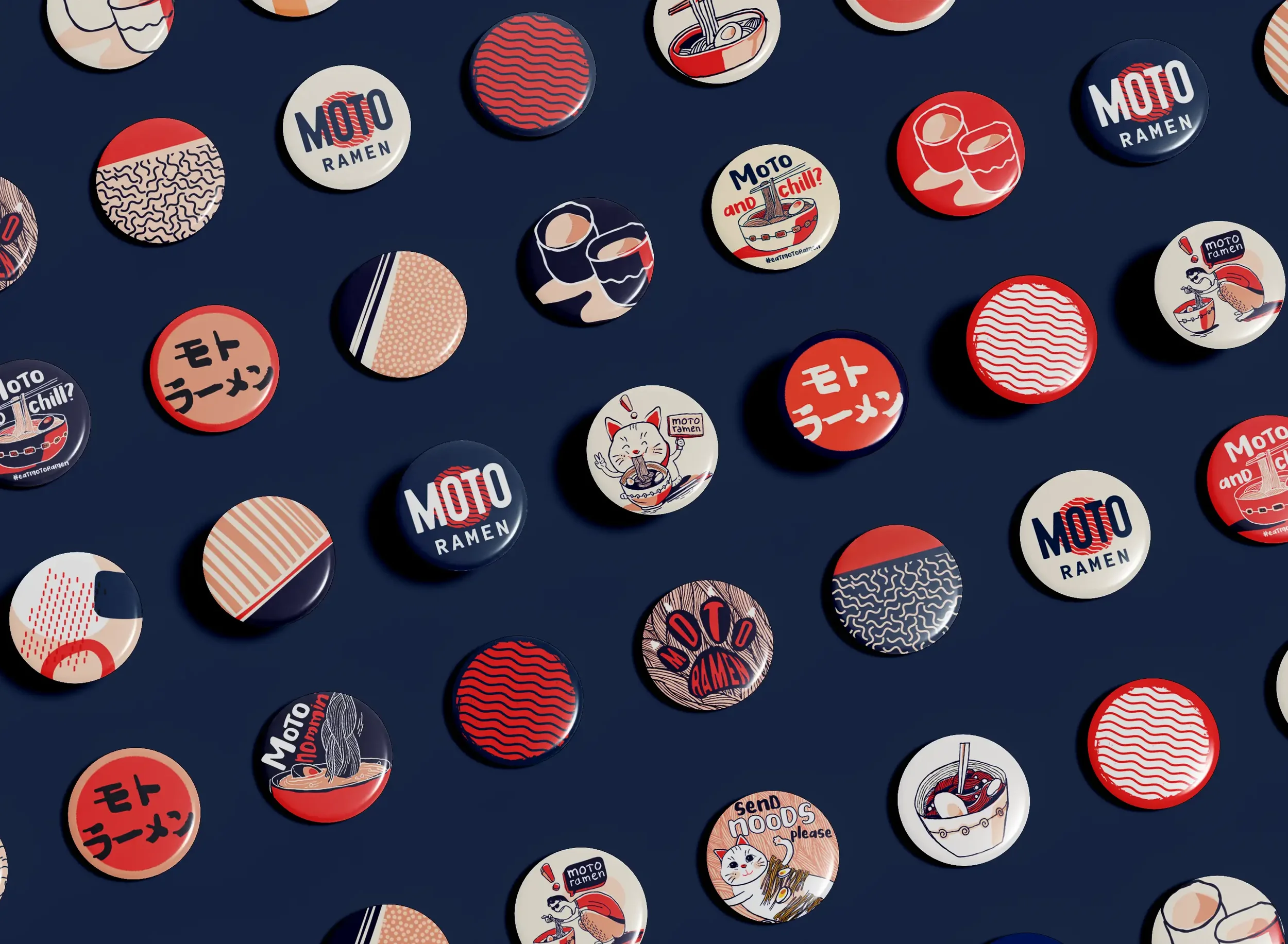
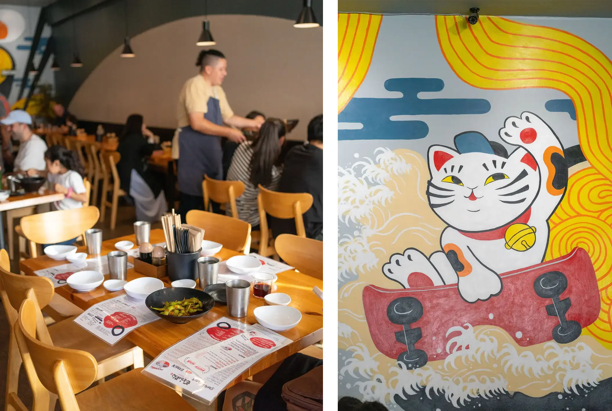
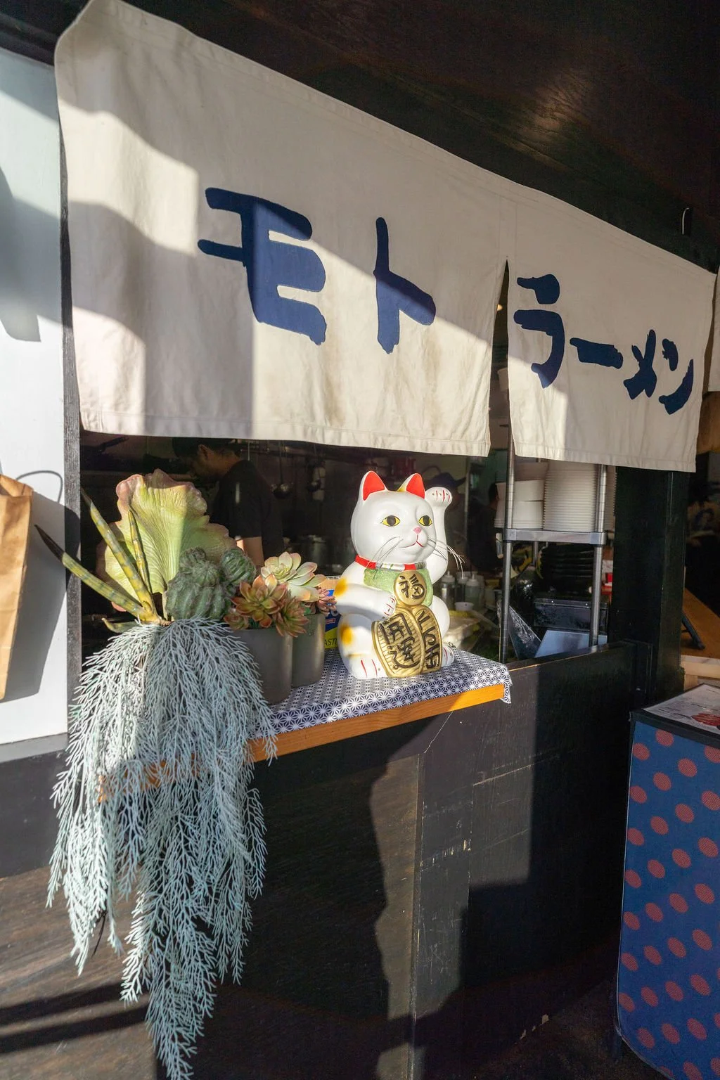
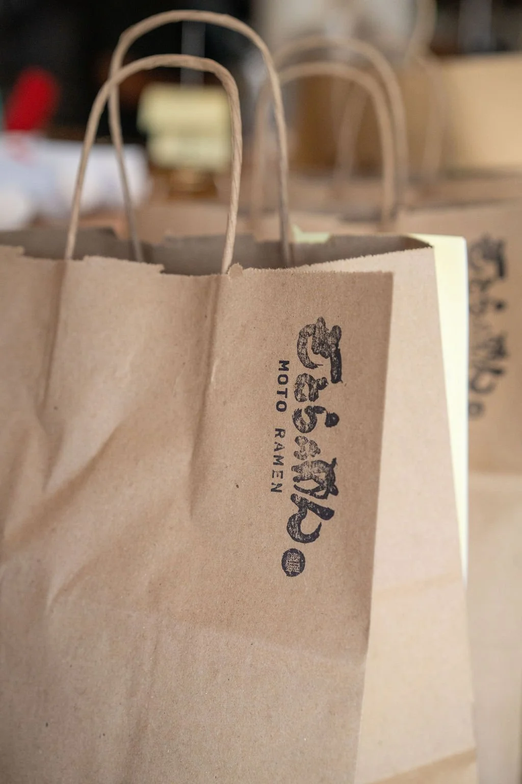
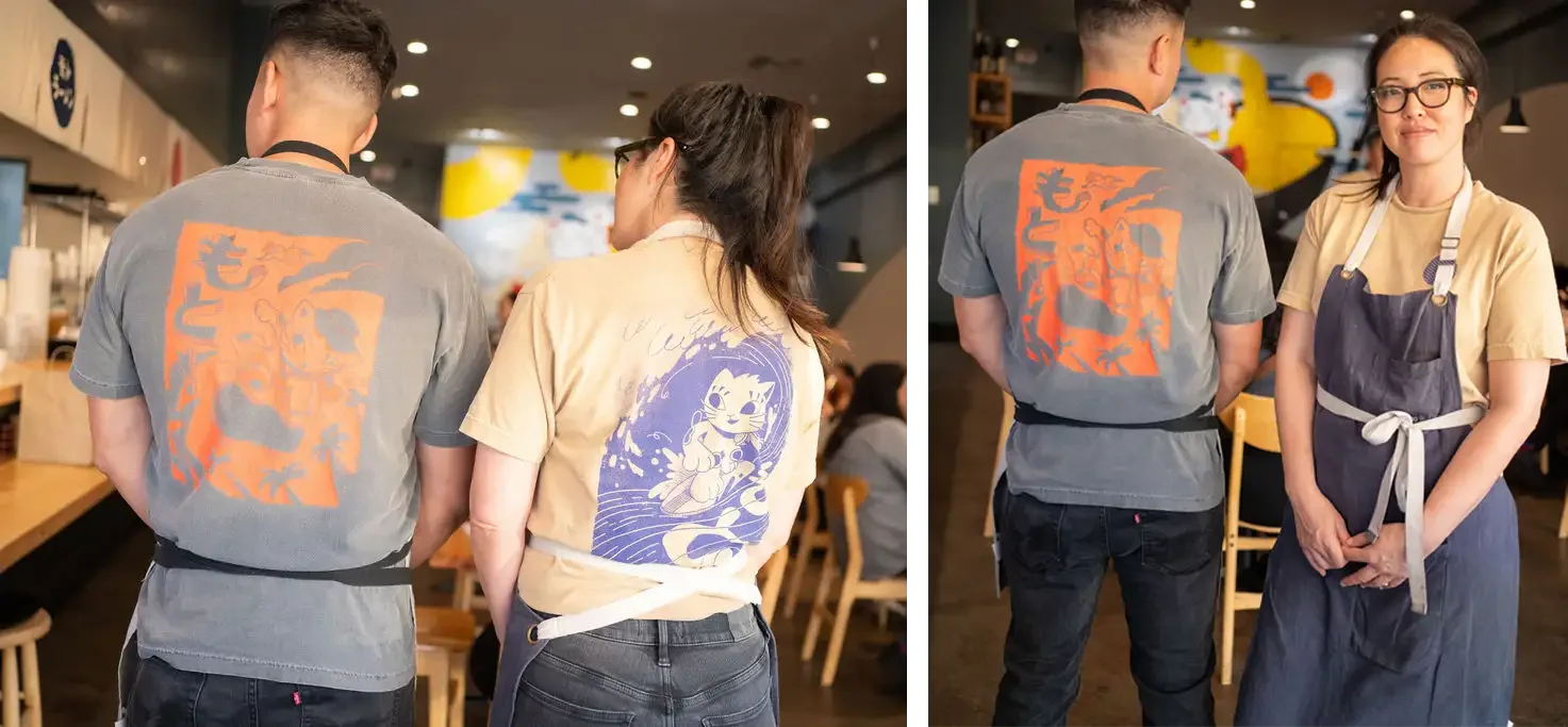
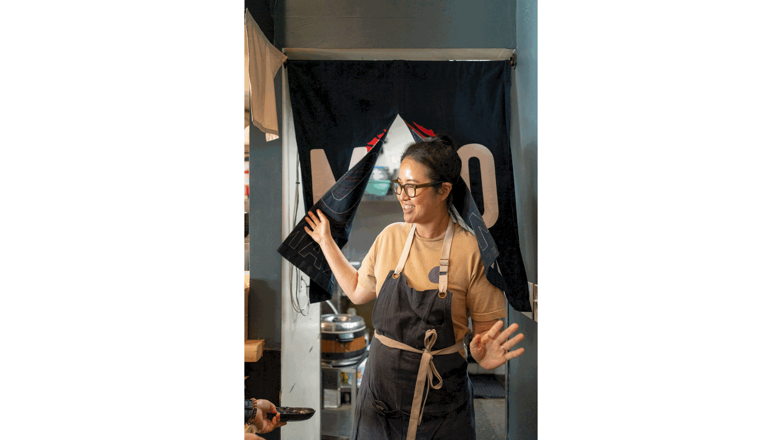
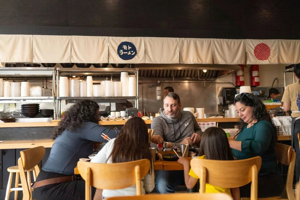
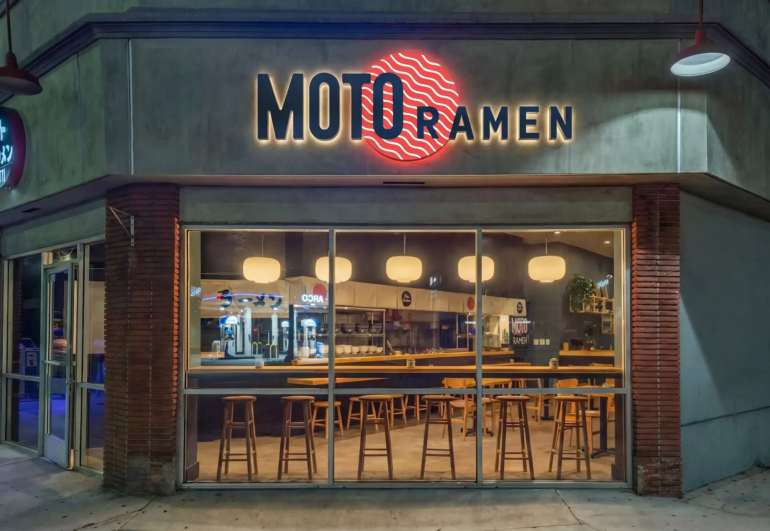
The Little Ramen Shop that Did
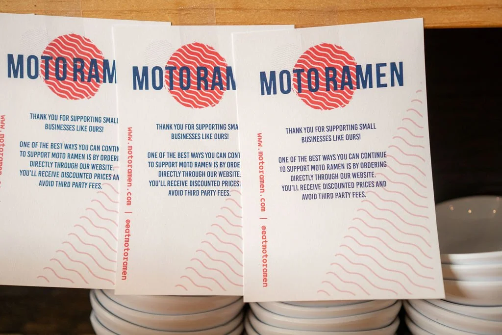
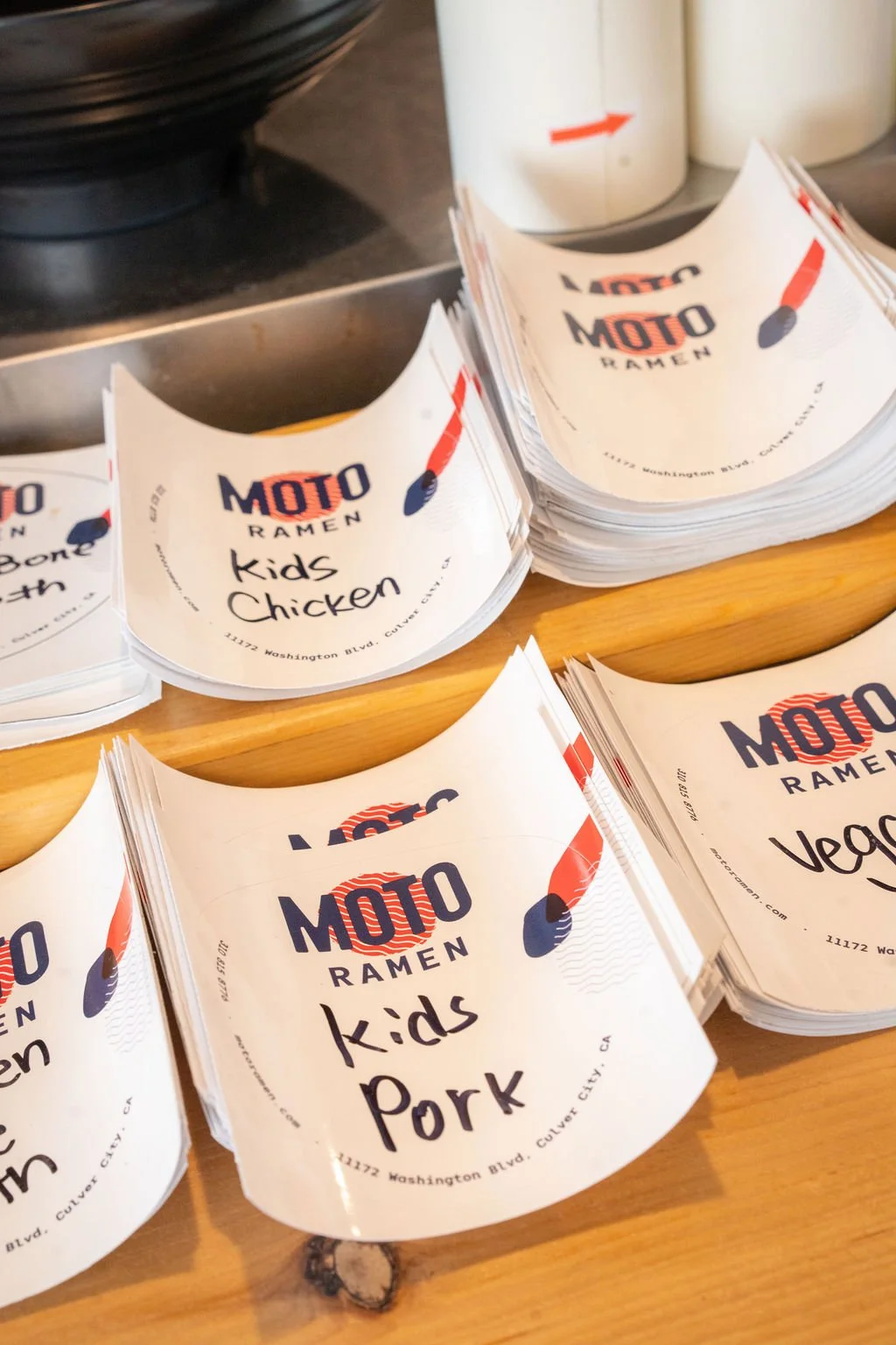
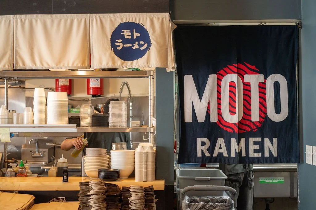
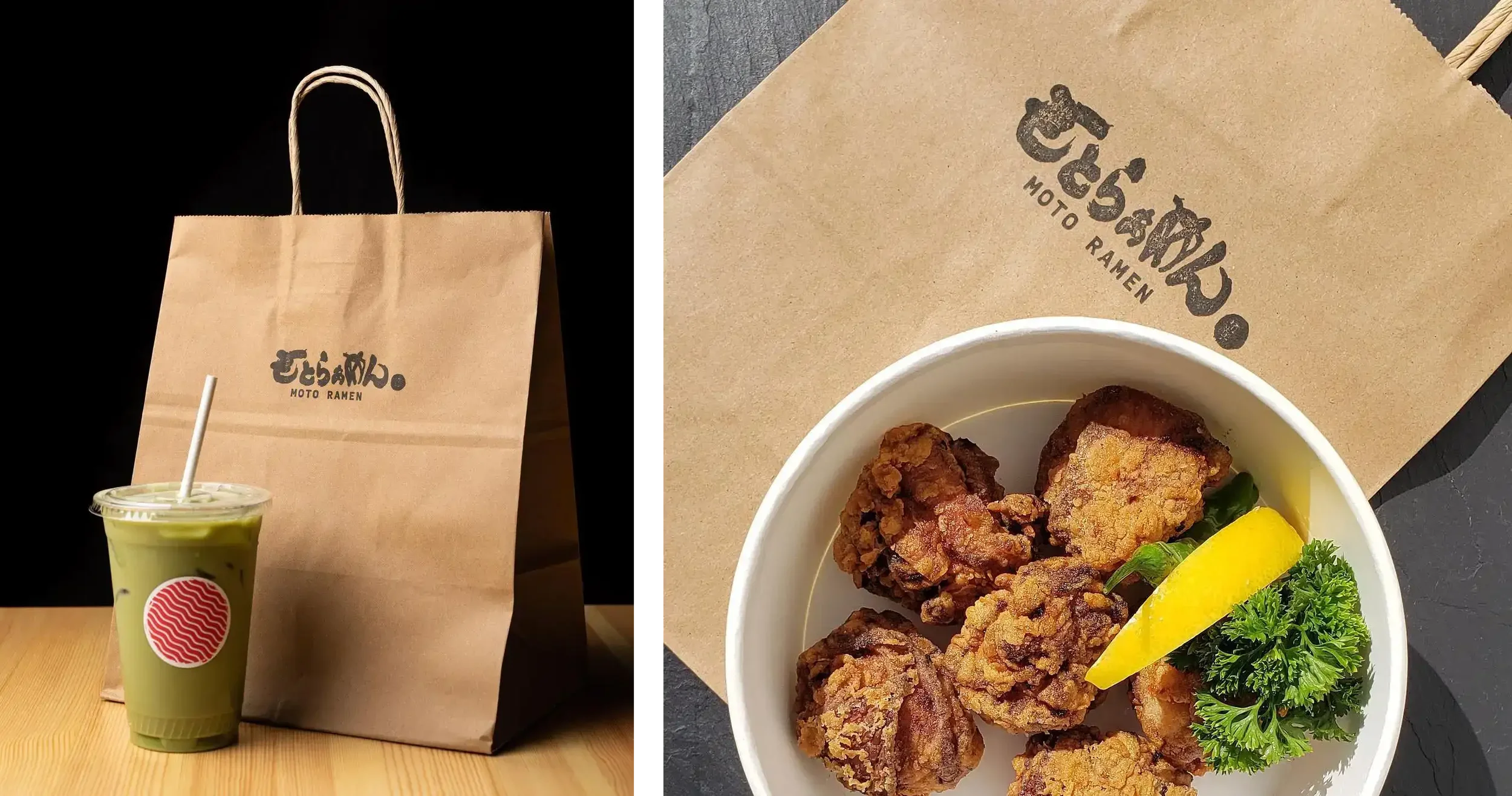
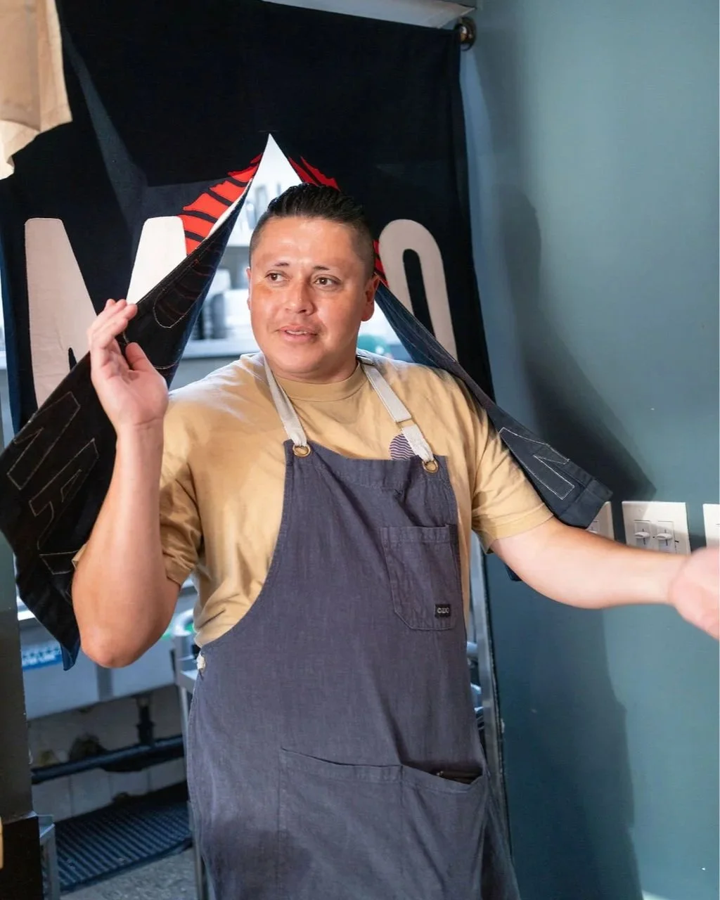
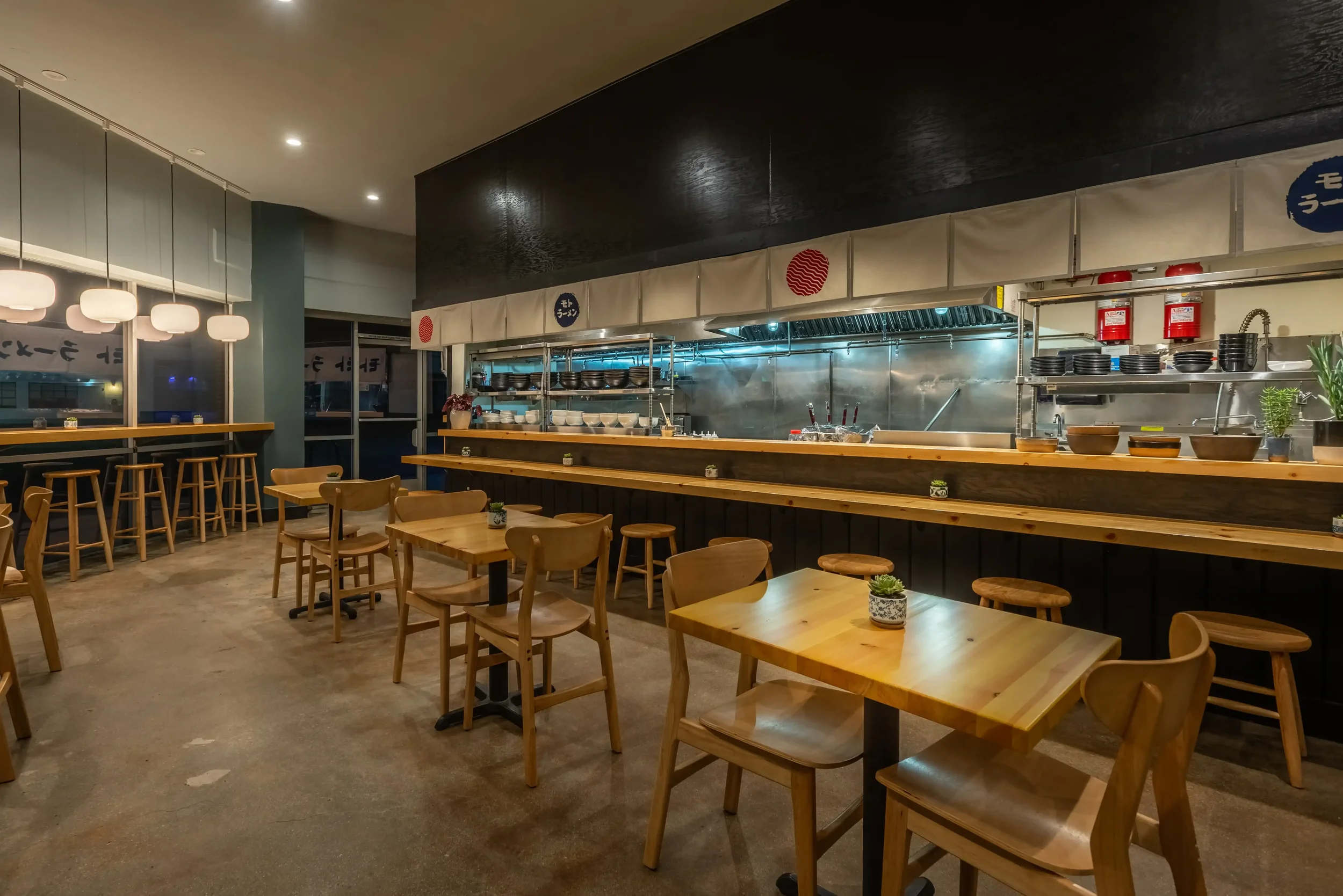
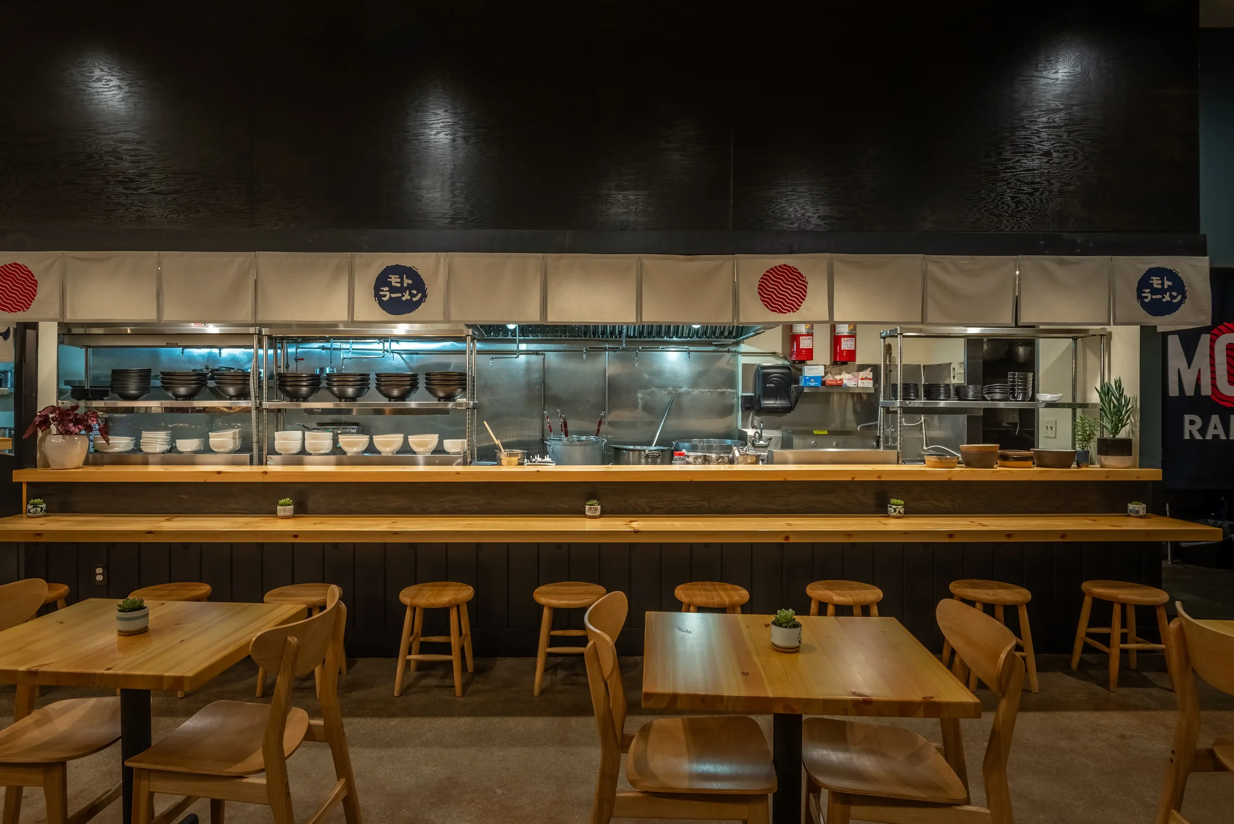
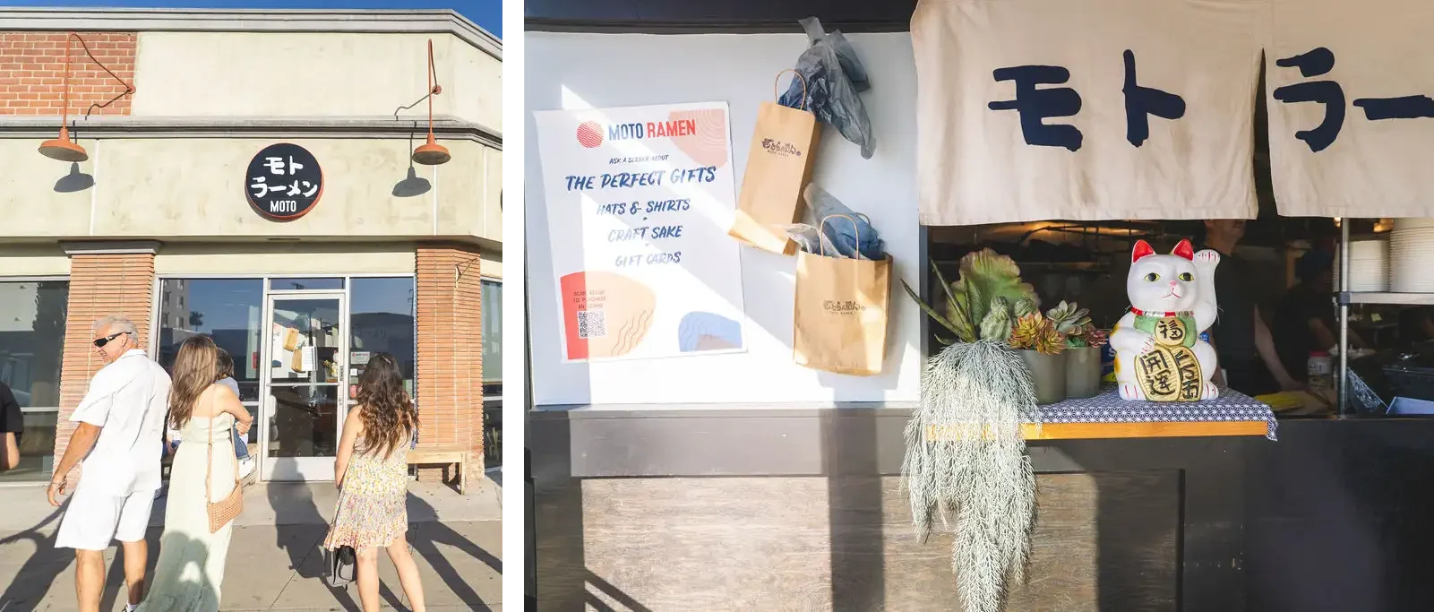
Launched during a global pandemic, there is no rational reason that a small Japanese Ramen startup should have survived. Moto — meaning origin, roots, heritage — needed a brand identity that could carry that meaning from the first glance. For this Culver City startup, we built a visual identity from the ground up that honors the Okinawan traditions behind the menu while feeling unmistakably LA. From logo and typography to the full brand system, the result is a restaurant brand with real personality: warm, bold, and rooted.
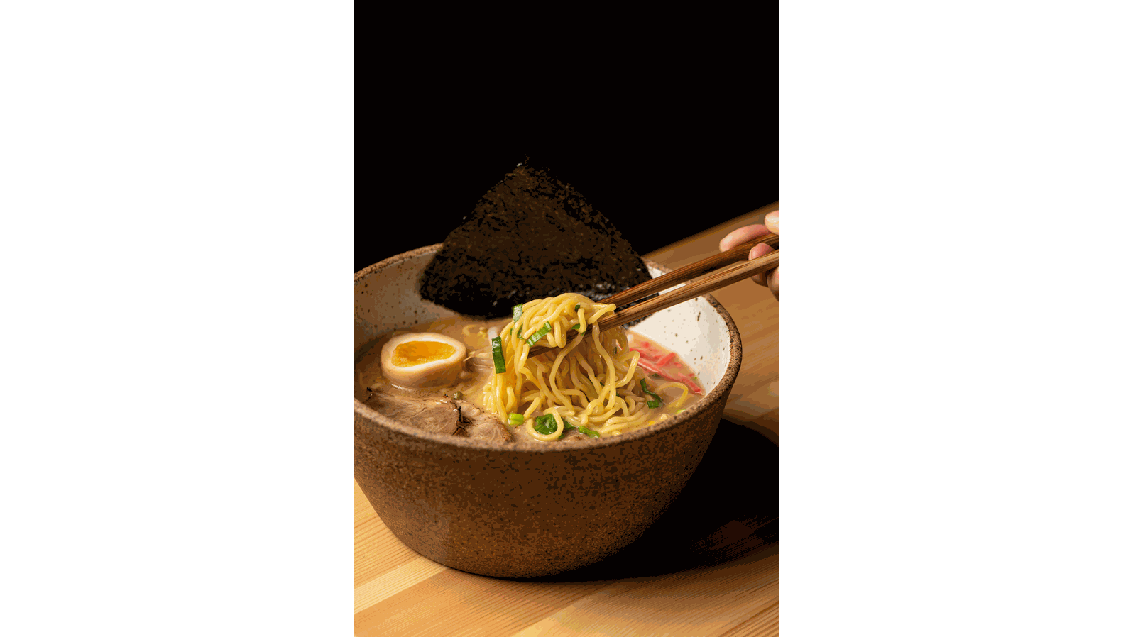
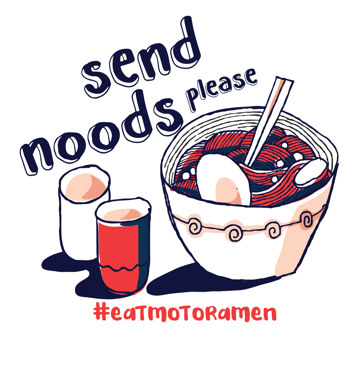
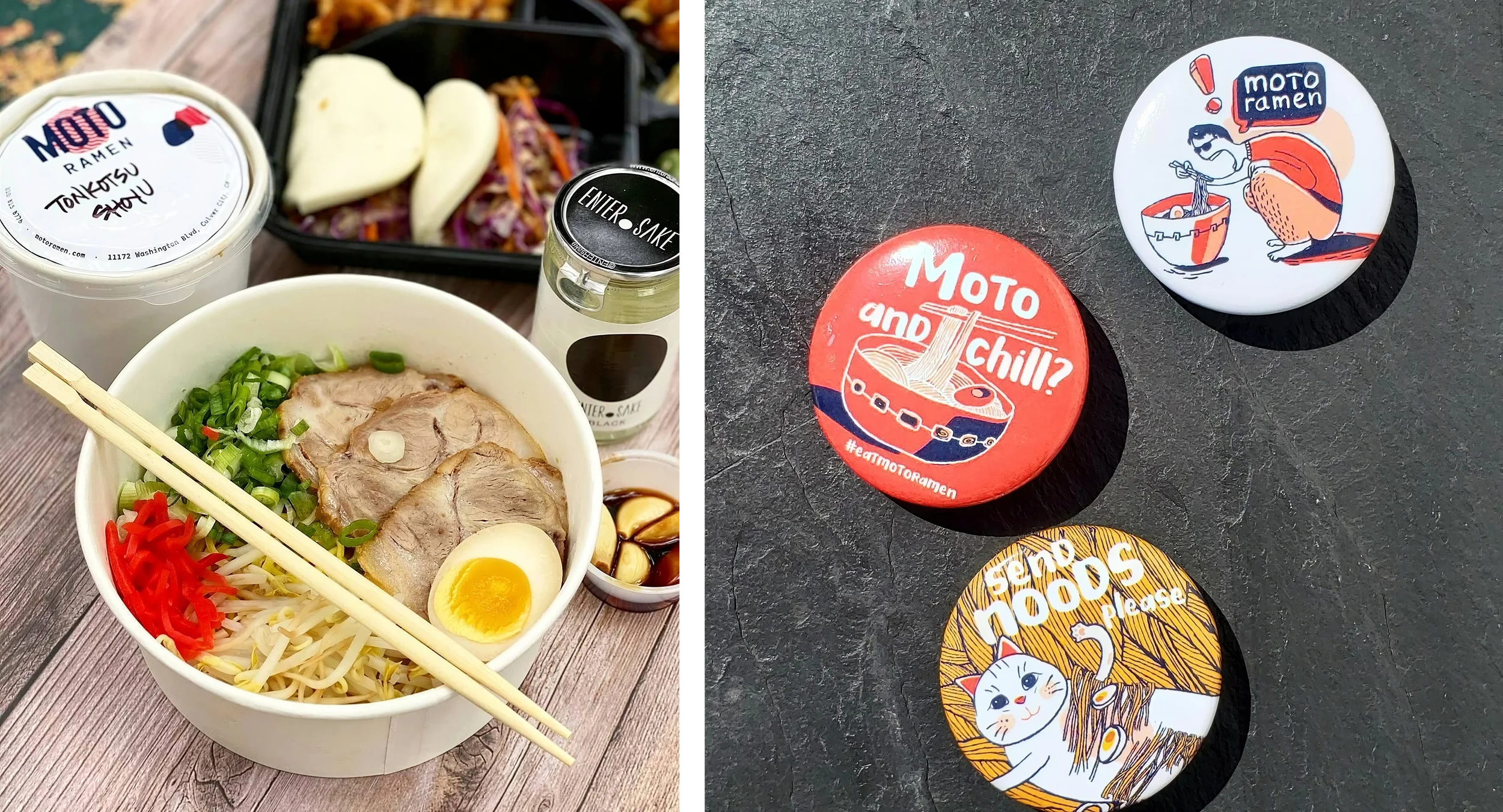
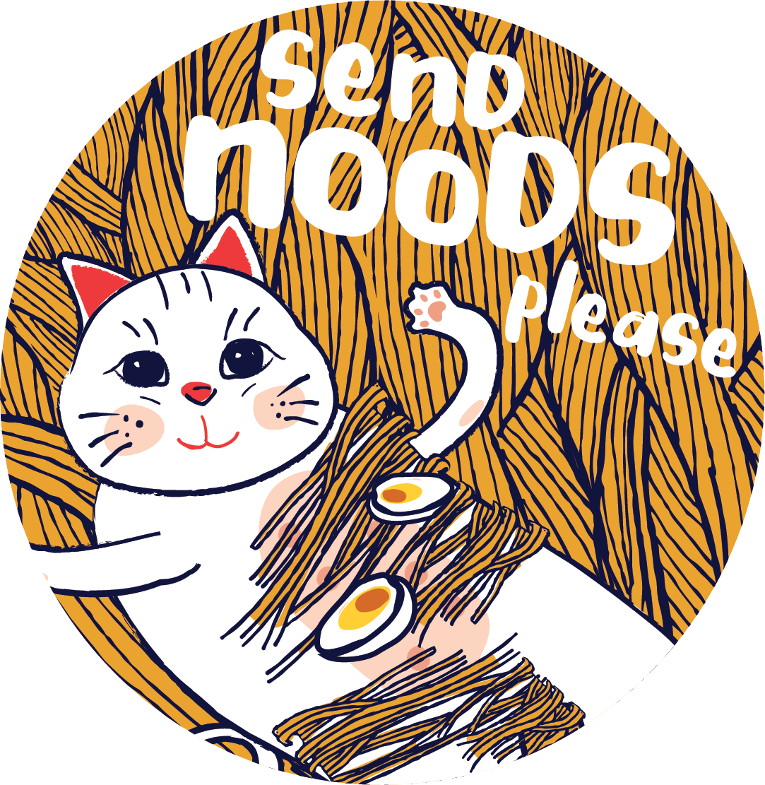
Send Noods, Please.
(Please note: I receive no reciprocation for your patronage of the client’s site)