Eternity is the best policy
CONTEXT
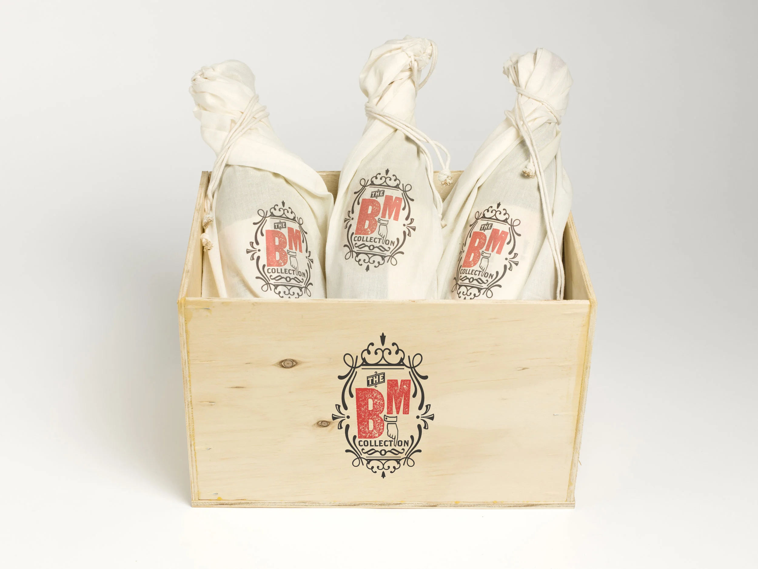
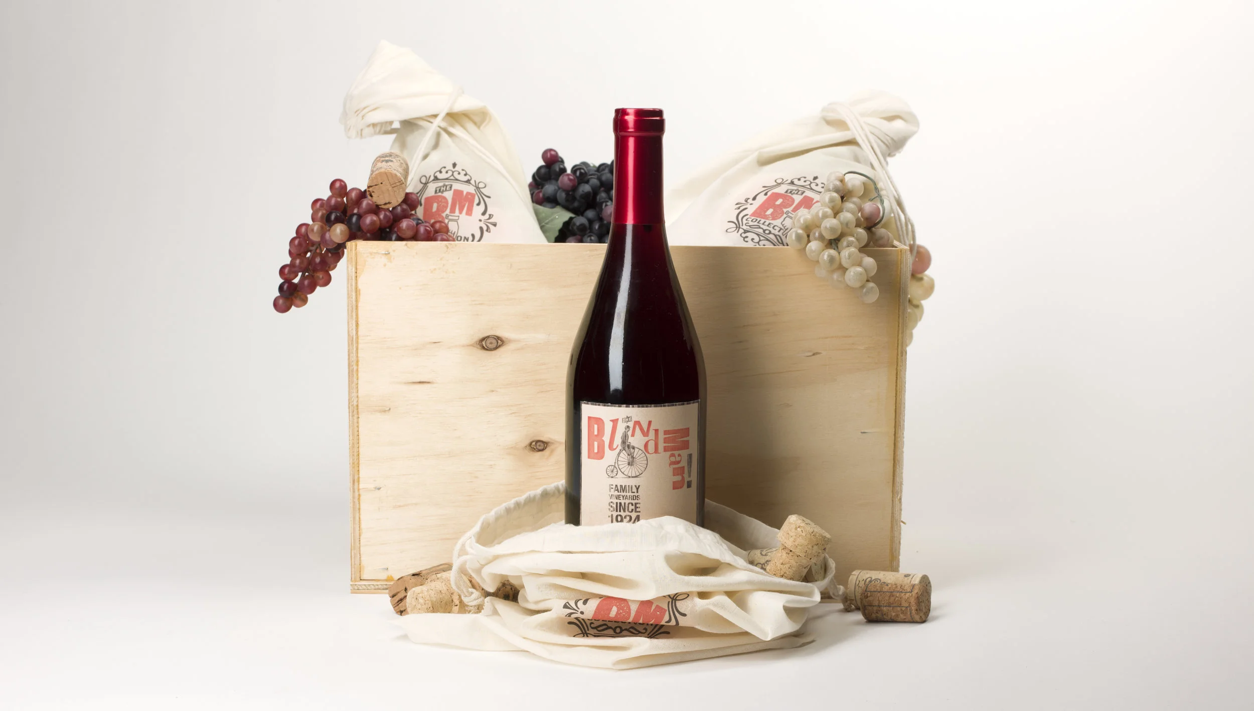
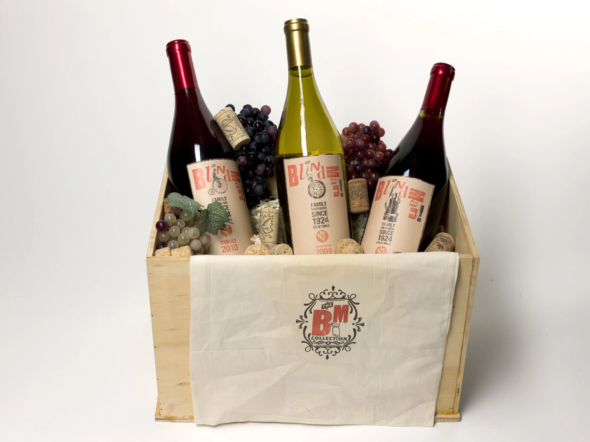
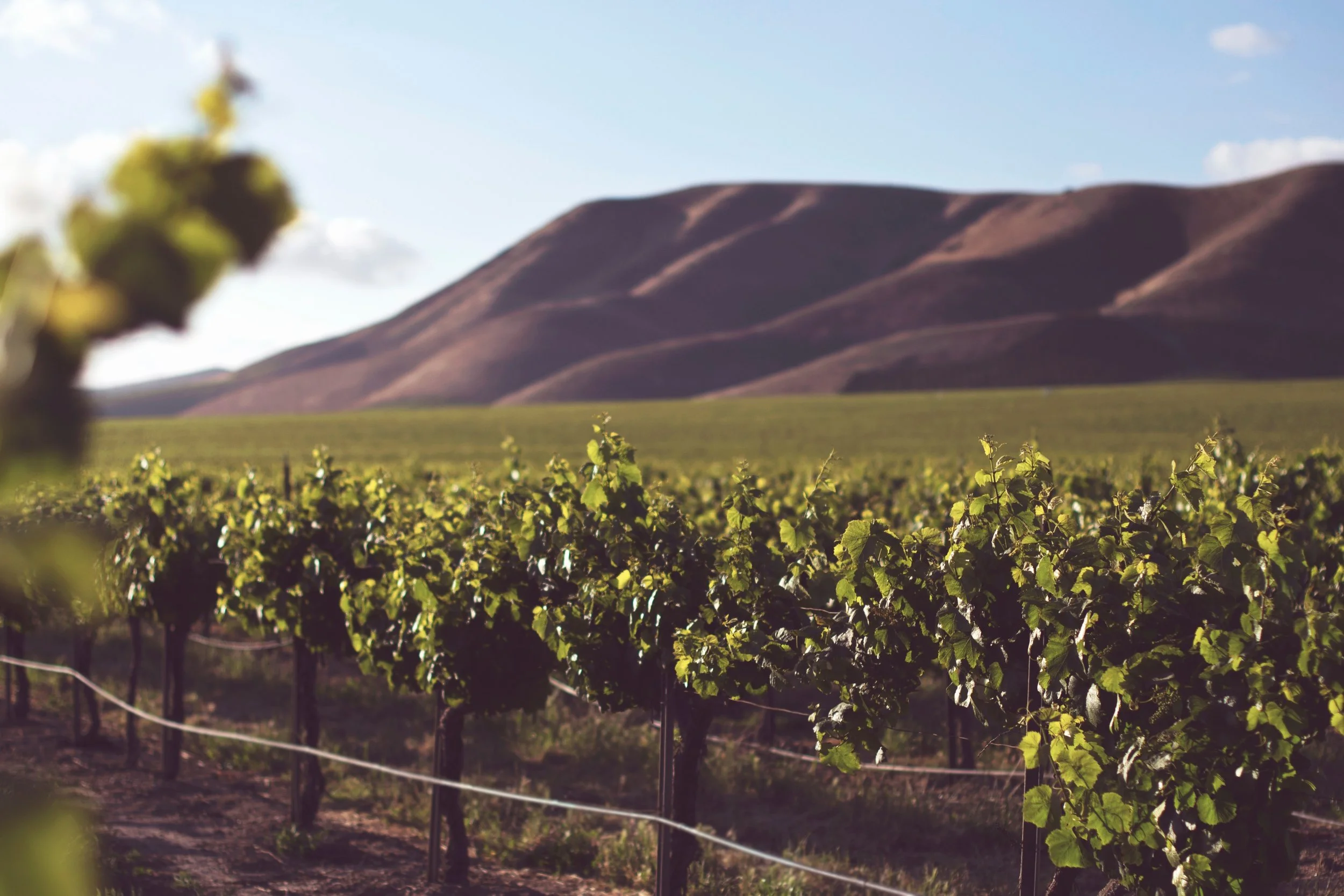
Nestled in the fertile valley of Sonoma, California, The Blind Man Winery makes quality crafted wines with a vintage aesthetic. The name "The BlindMan" is based off the Dadaist journal produced in the early 20th century.
CHALLENGE
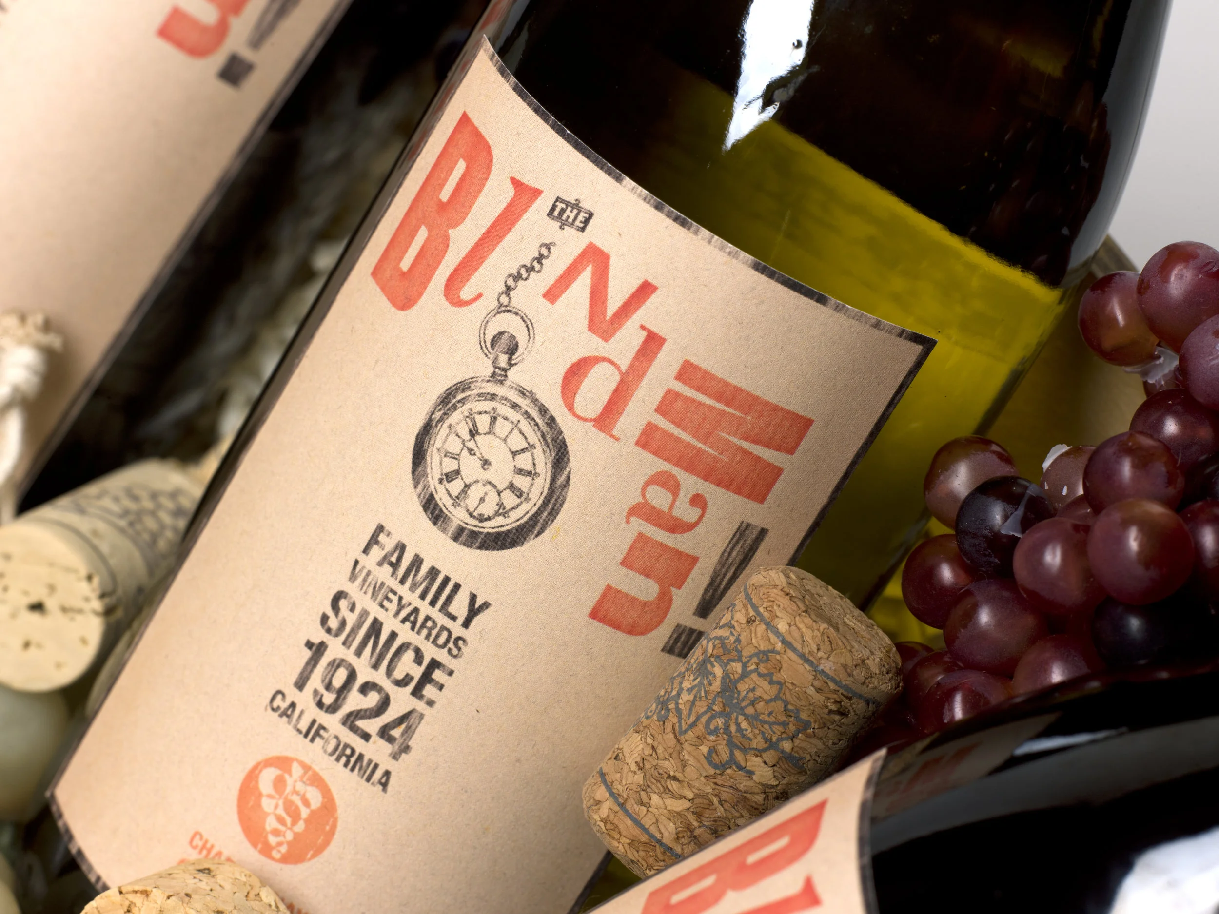
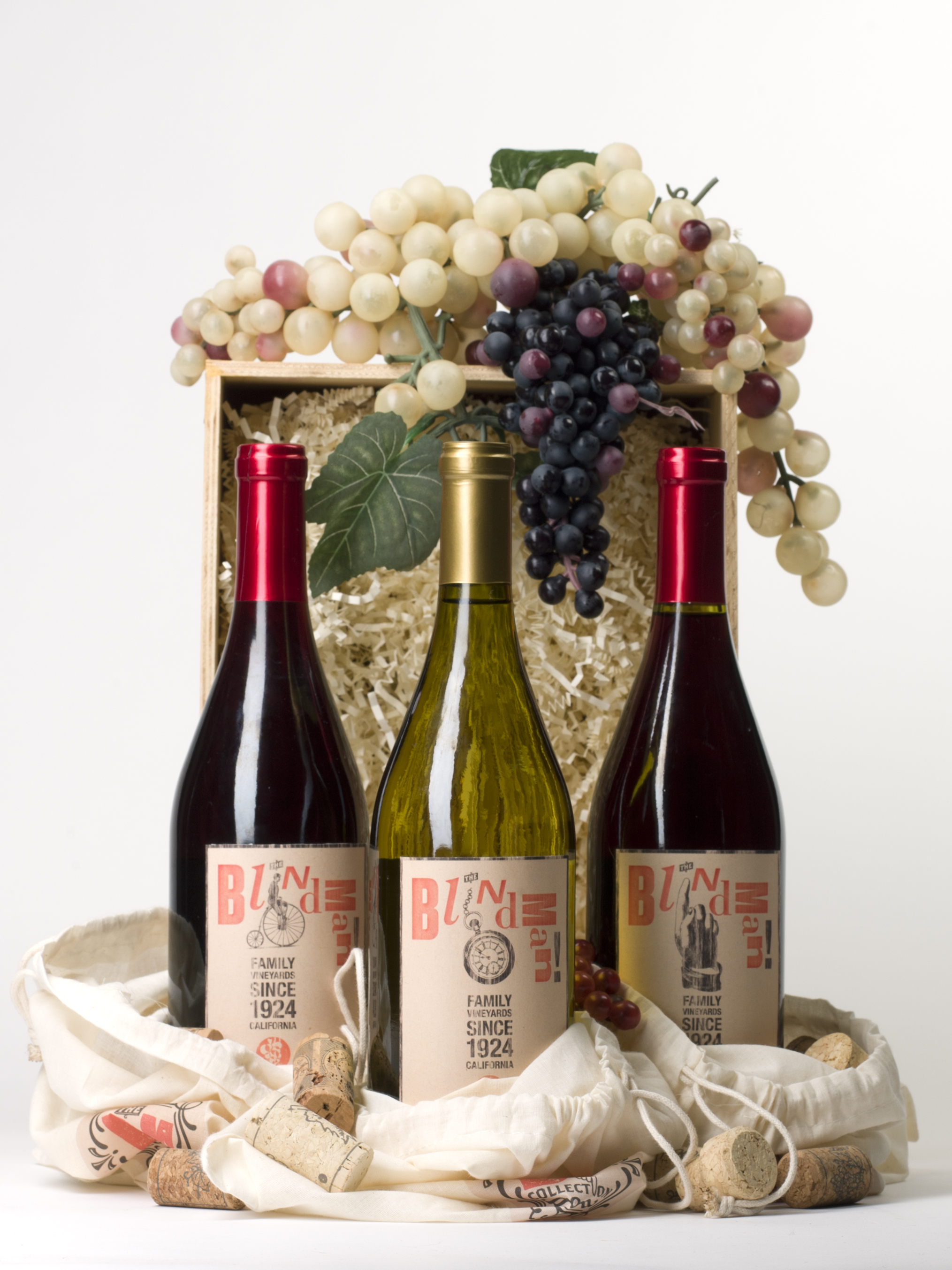
Most wine company labels look nearly identical: traditional serif typeface with some sort of illustrated rendered image of the winery itself. All in all - boring and unoriginal.
CONCEPT
To create a truly unique label and identity for this winery, I wanted to utilize the production techniques of the time period that inspired the wine. It brought the concept around full circle and brought the roaring 20's back to life in this vibrant design
SOLUTION
The imagery of the labels and overall identity stems from inspiration of the entire Dadaist movement. The execution and process of creating the suite was inspired by production processes of the time, including screen printing and letterpress. As Kurt Schwitters said, “Eternity is the best policy.”
AWARDS
SCAD Secession Awards finalist