
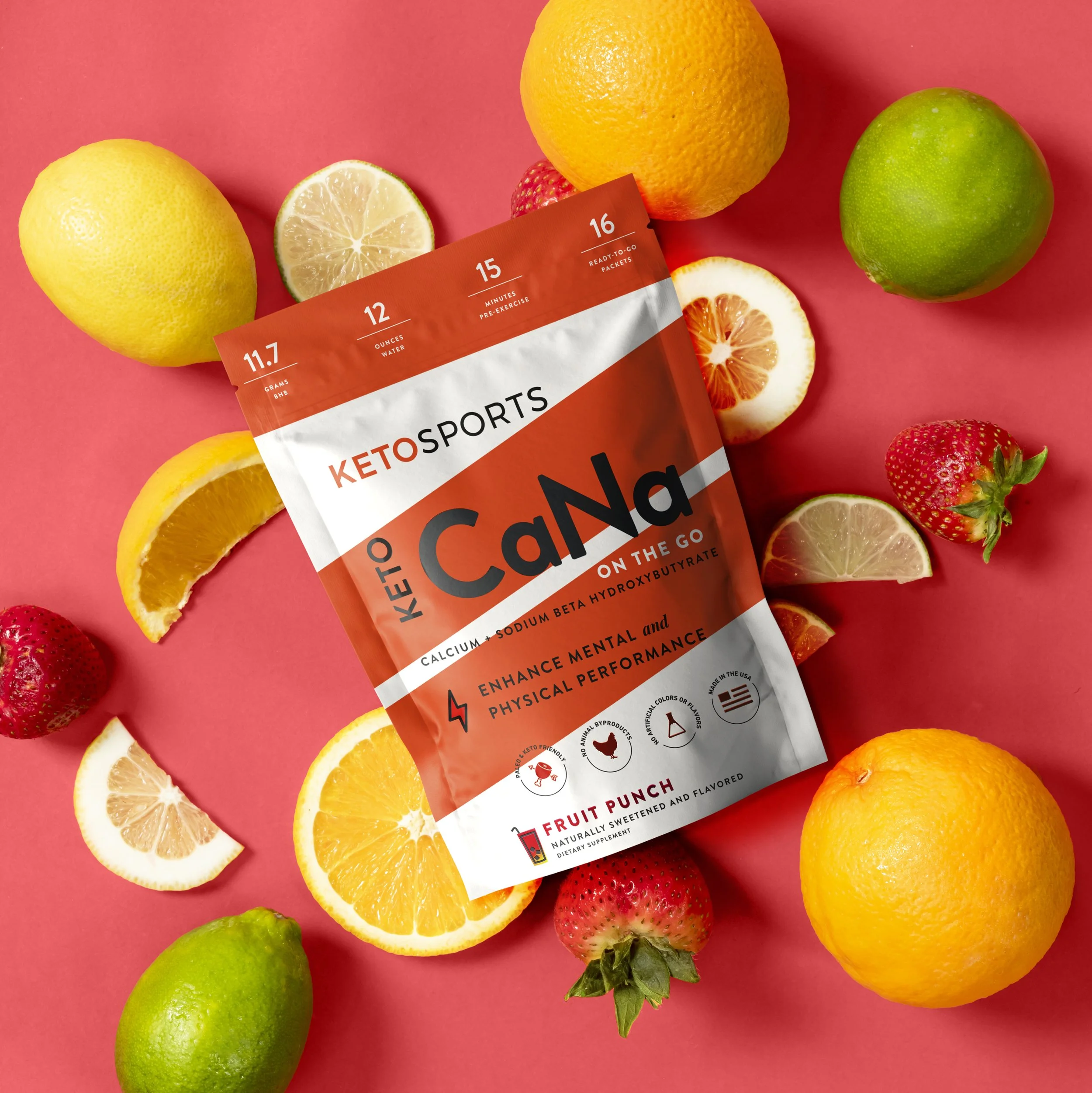
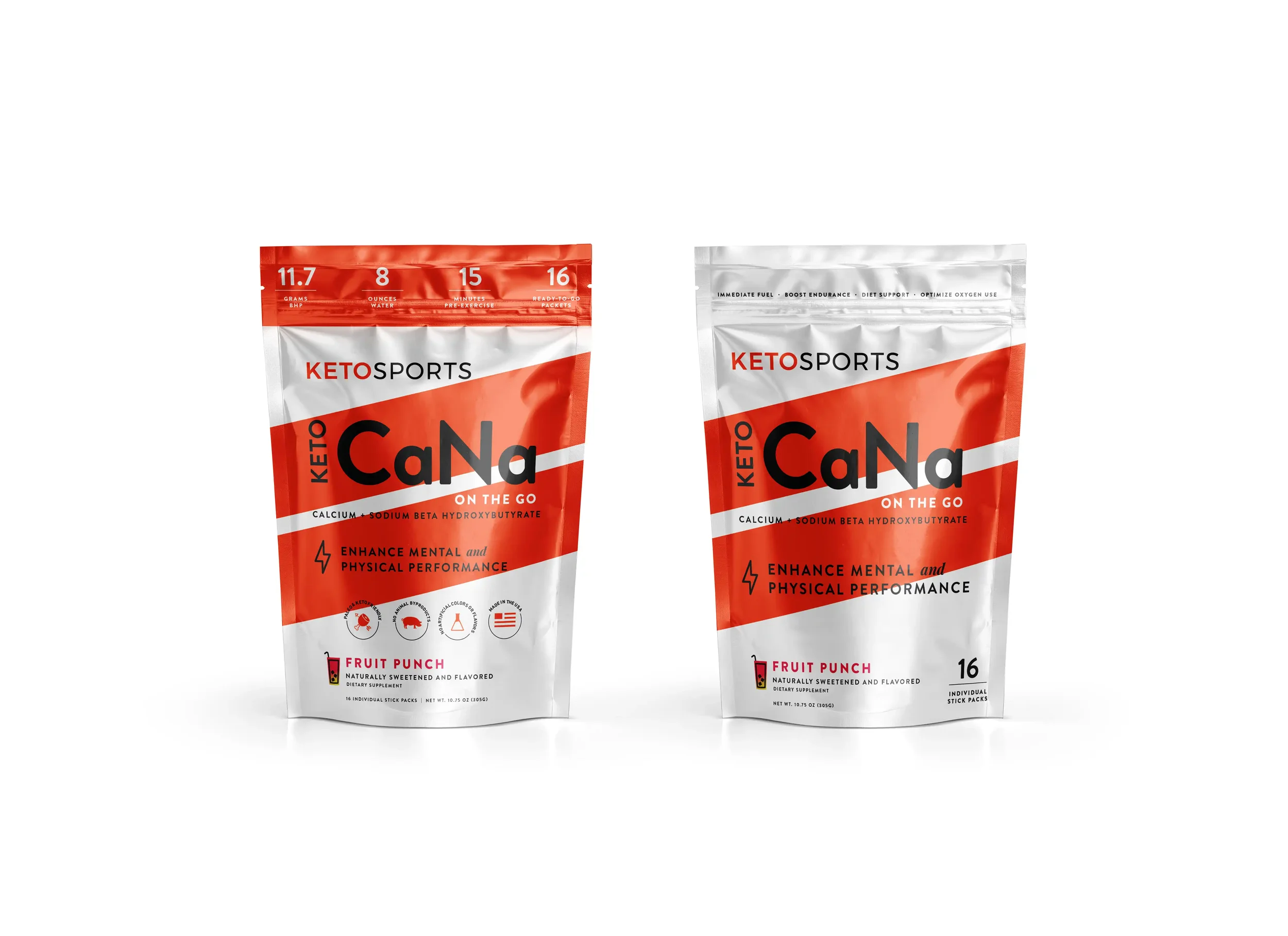
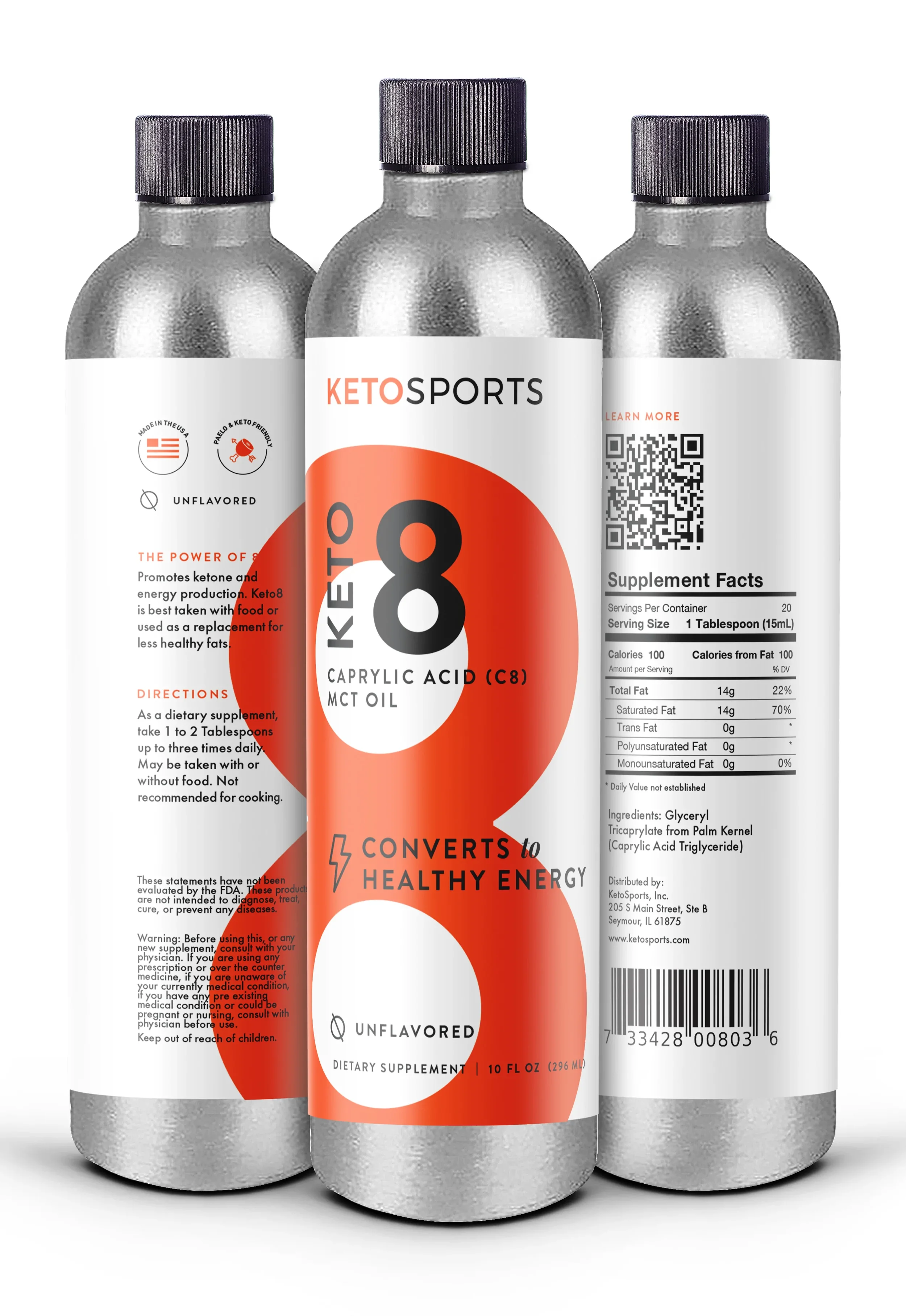
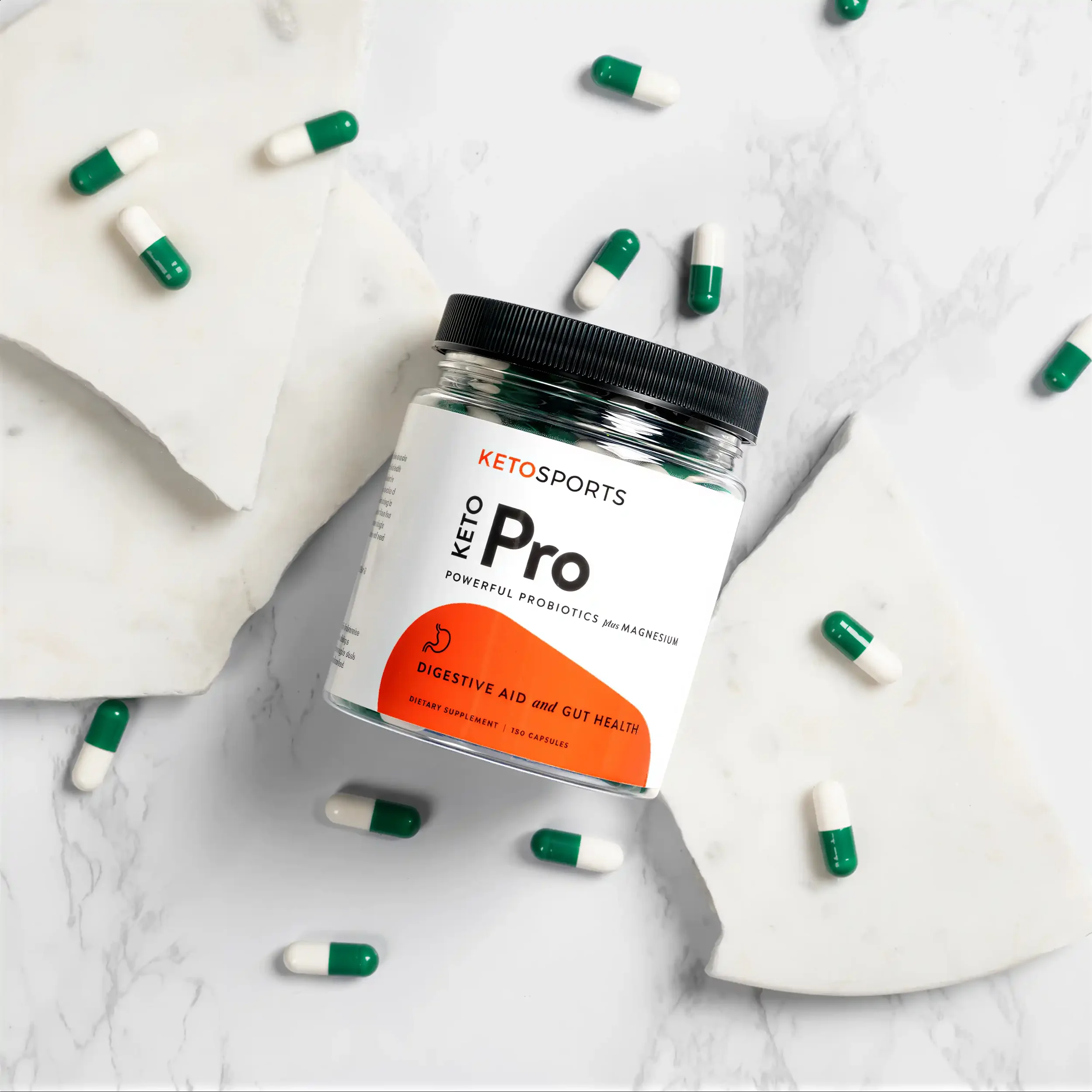
The Original Keto Diet Supplement
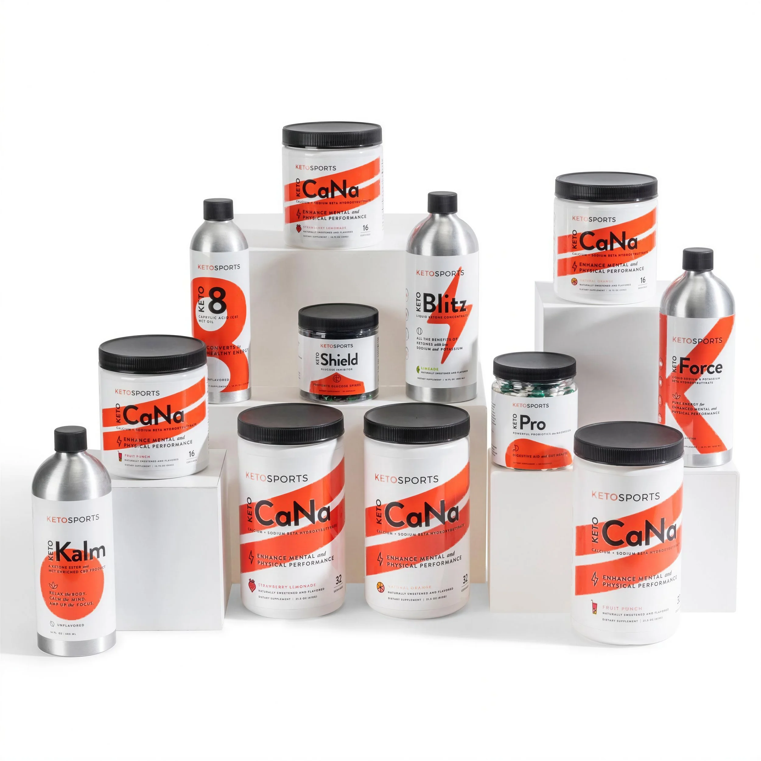
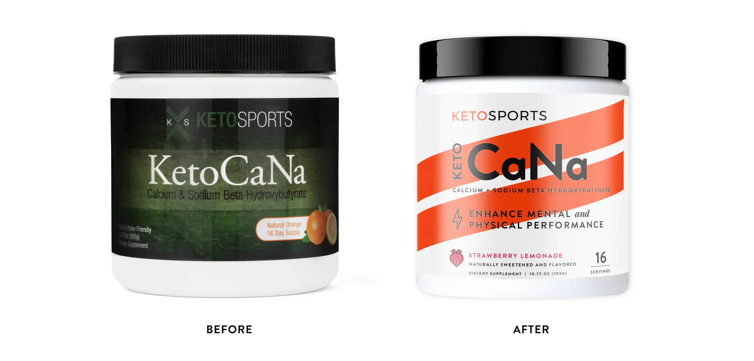
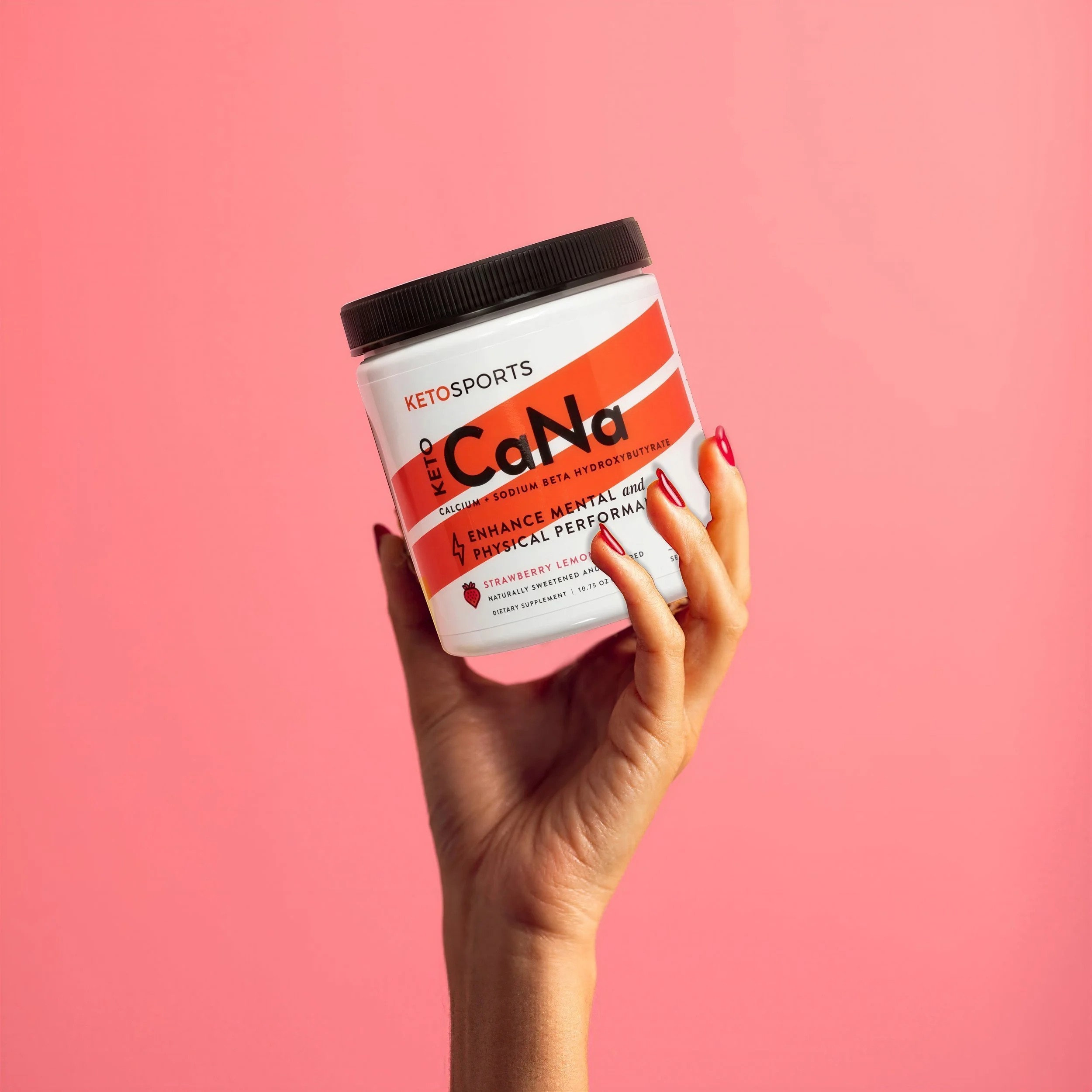
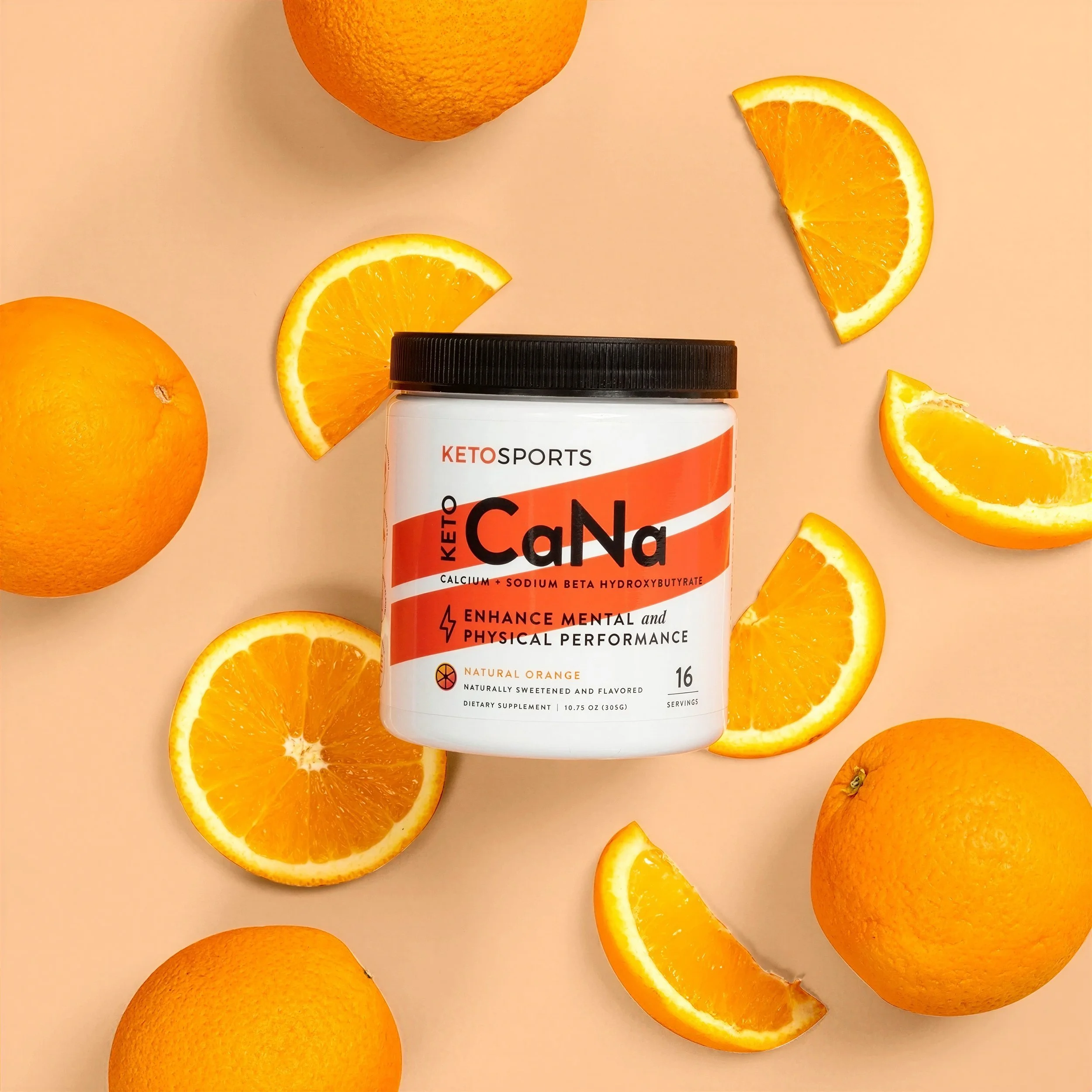
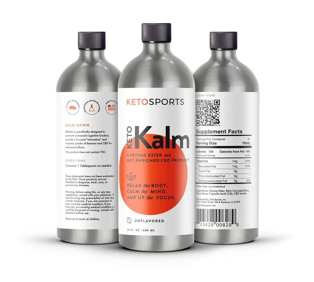
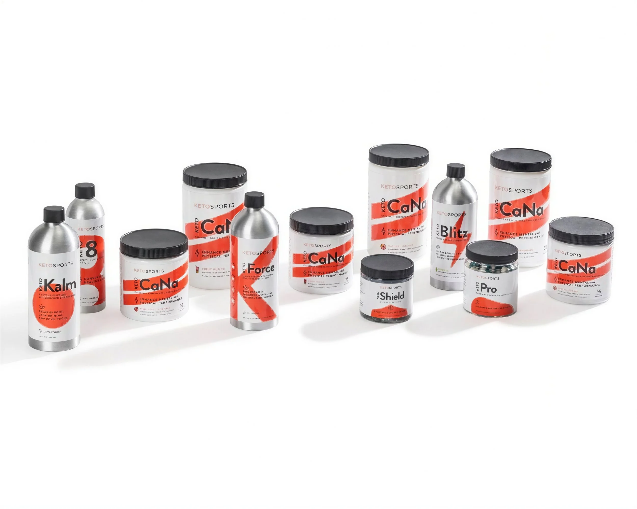
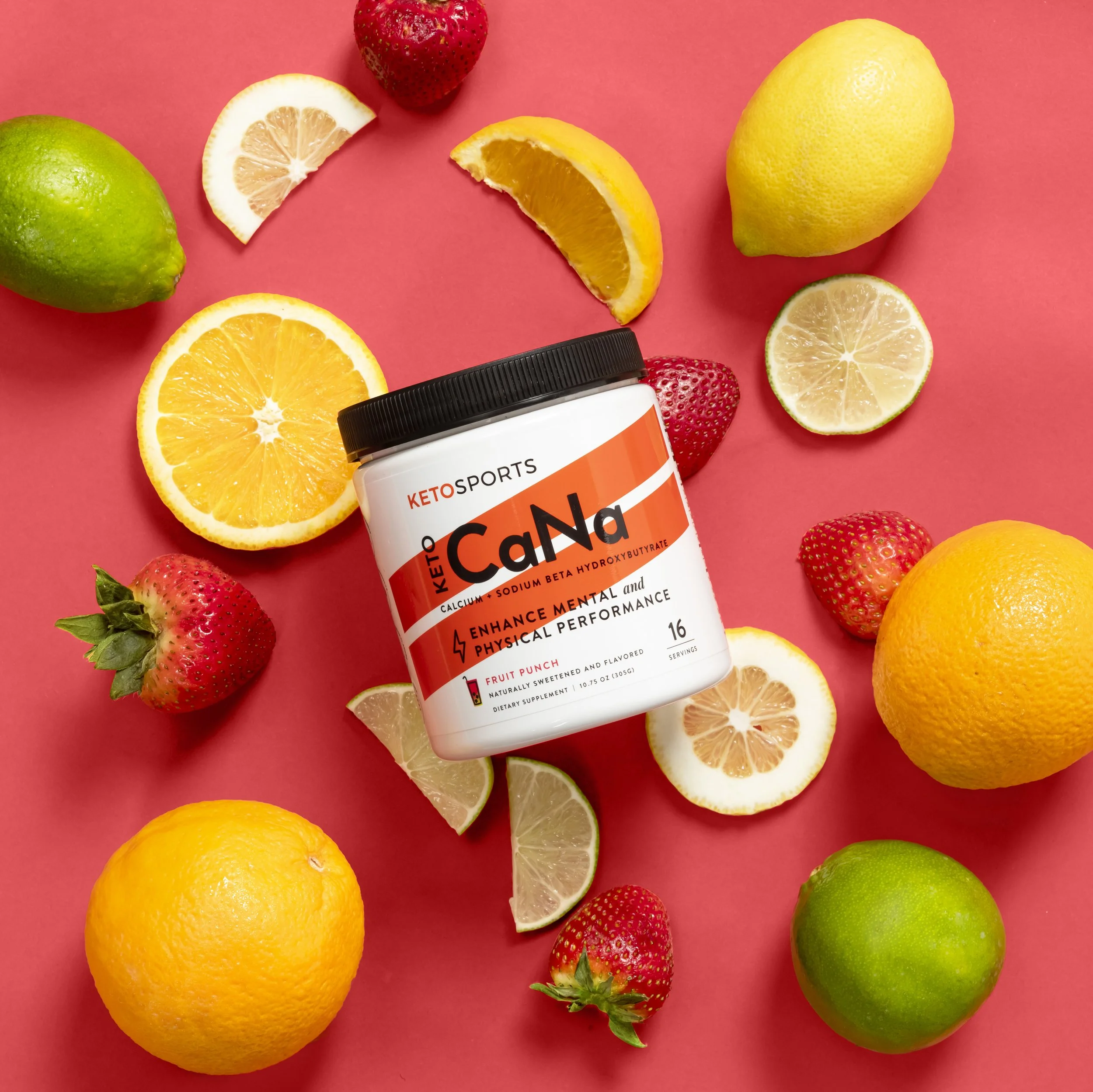
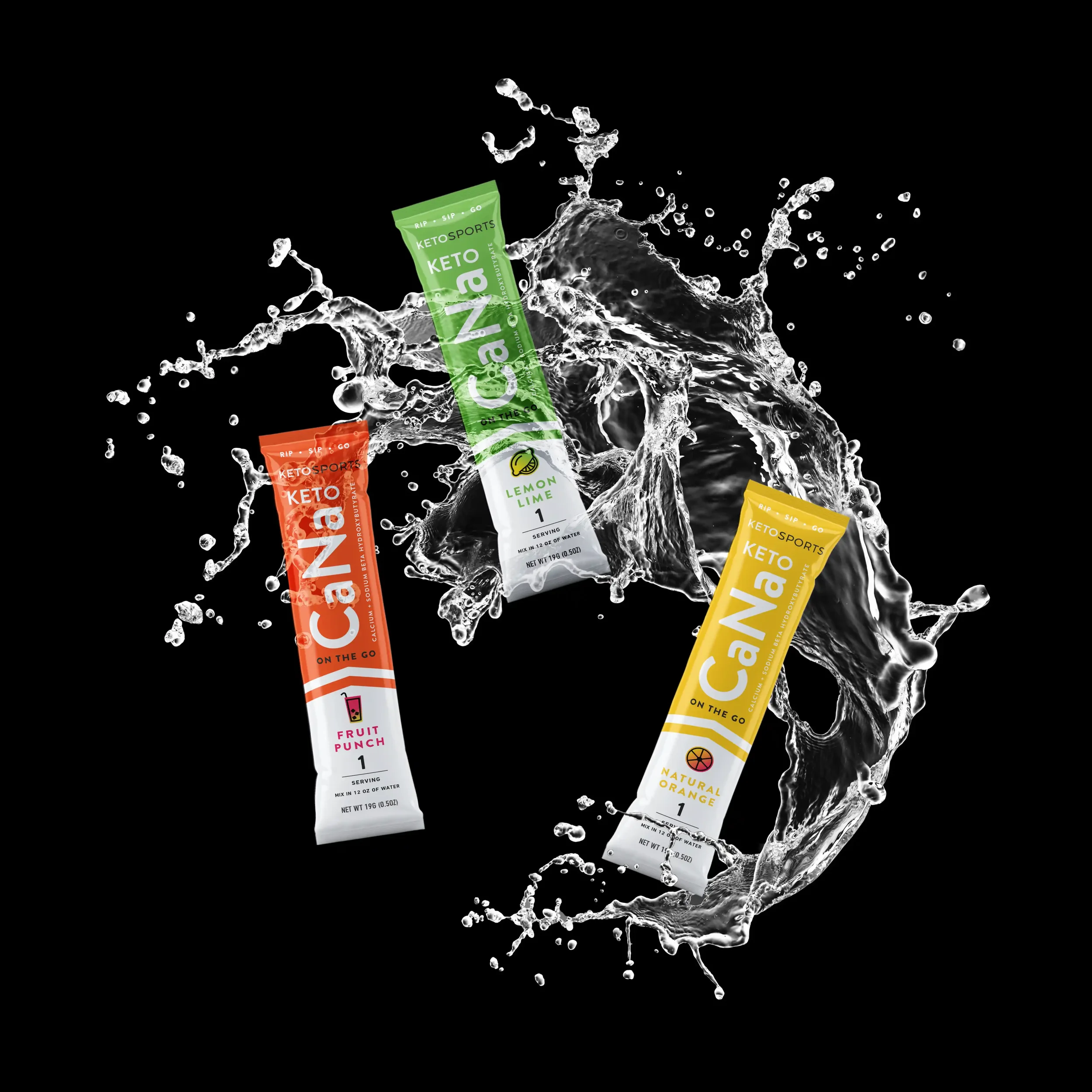
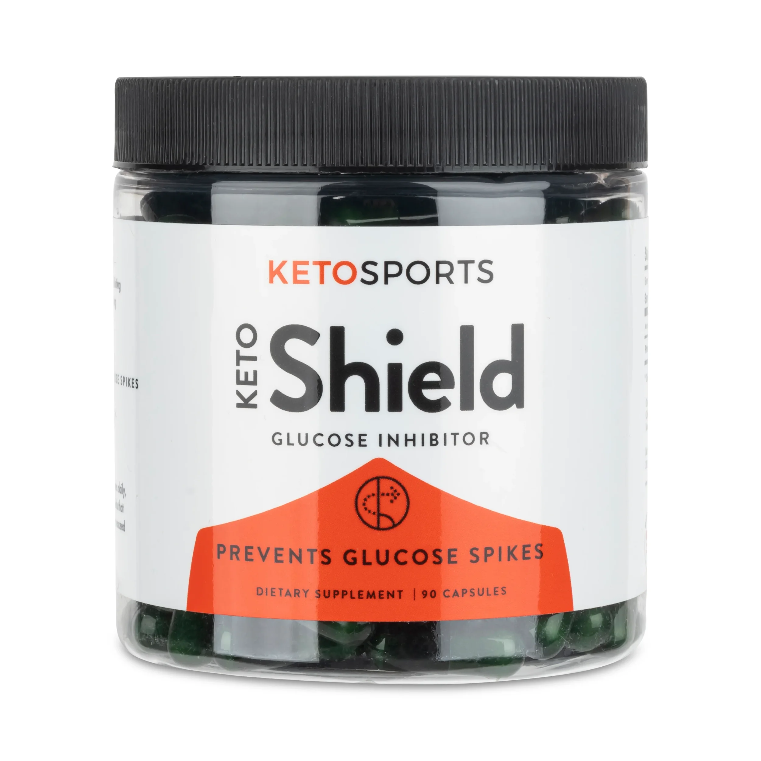
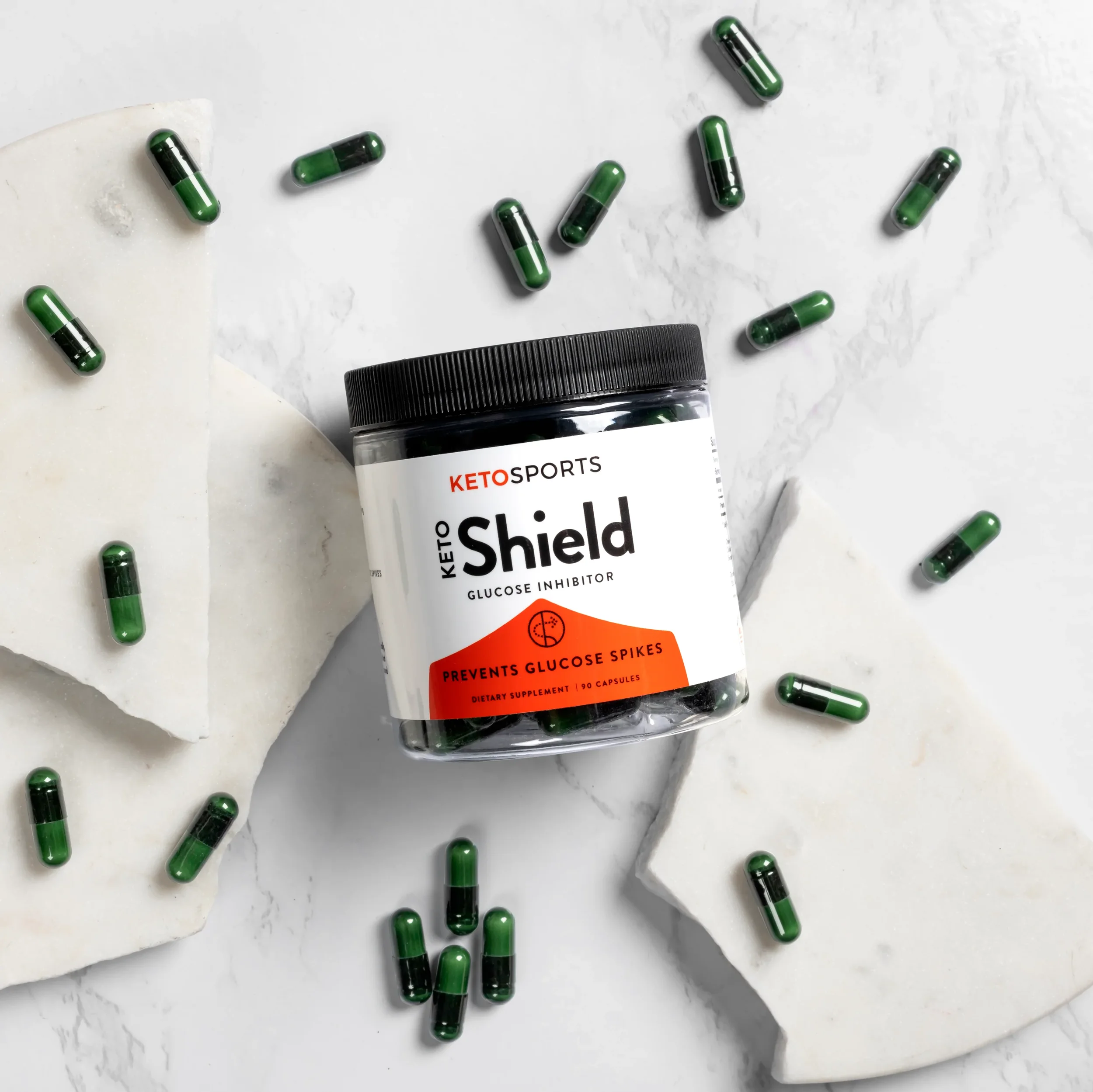
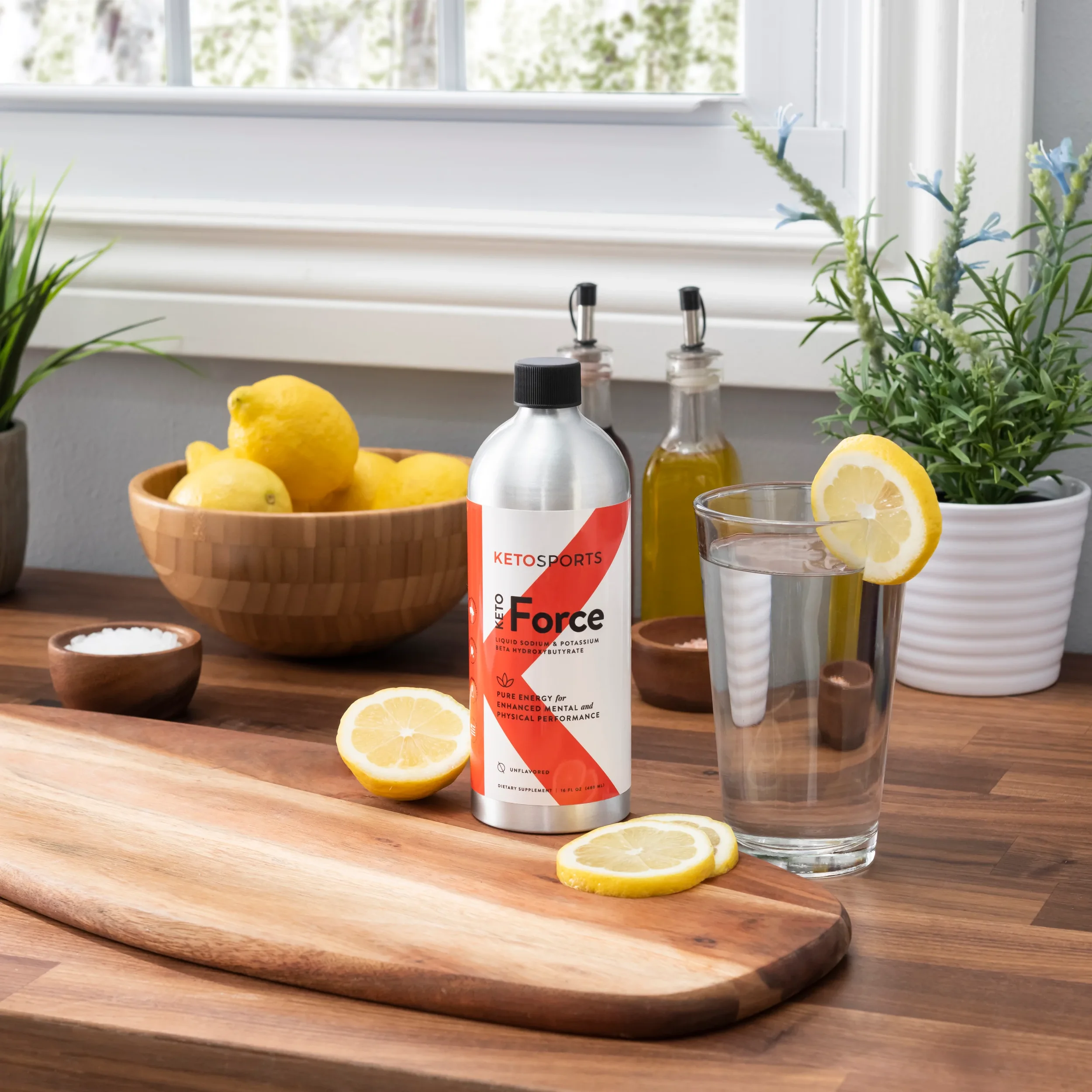
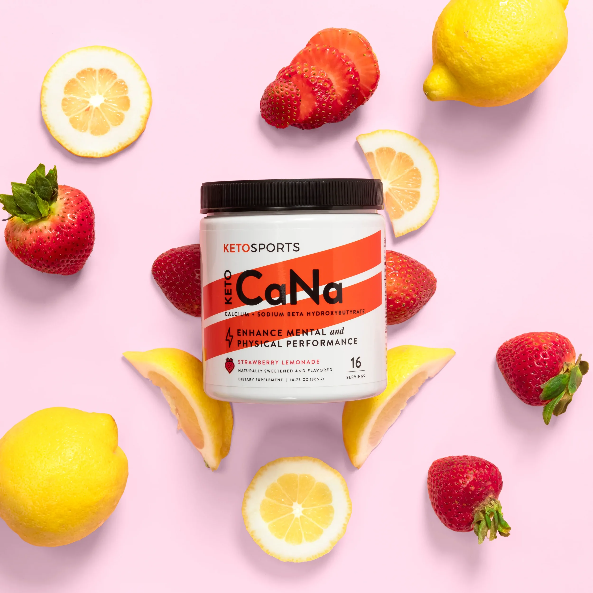
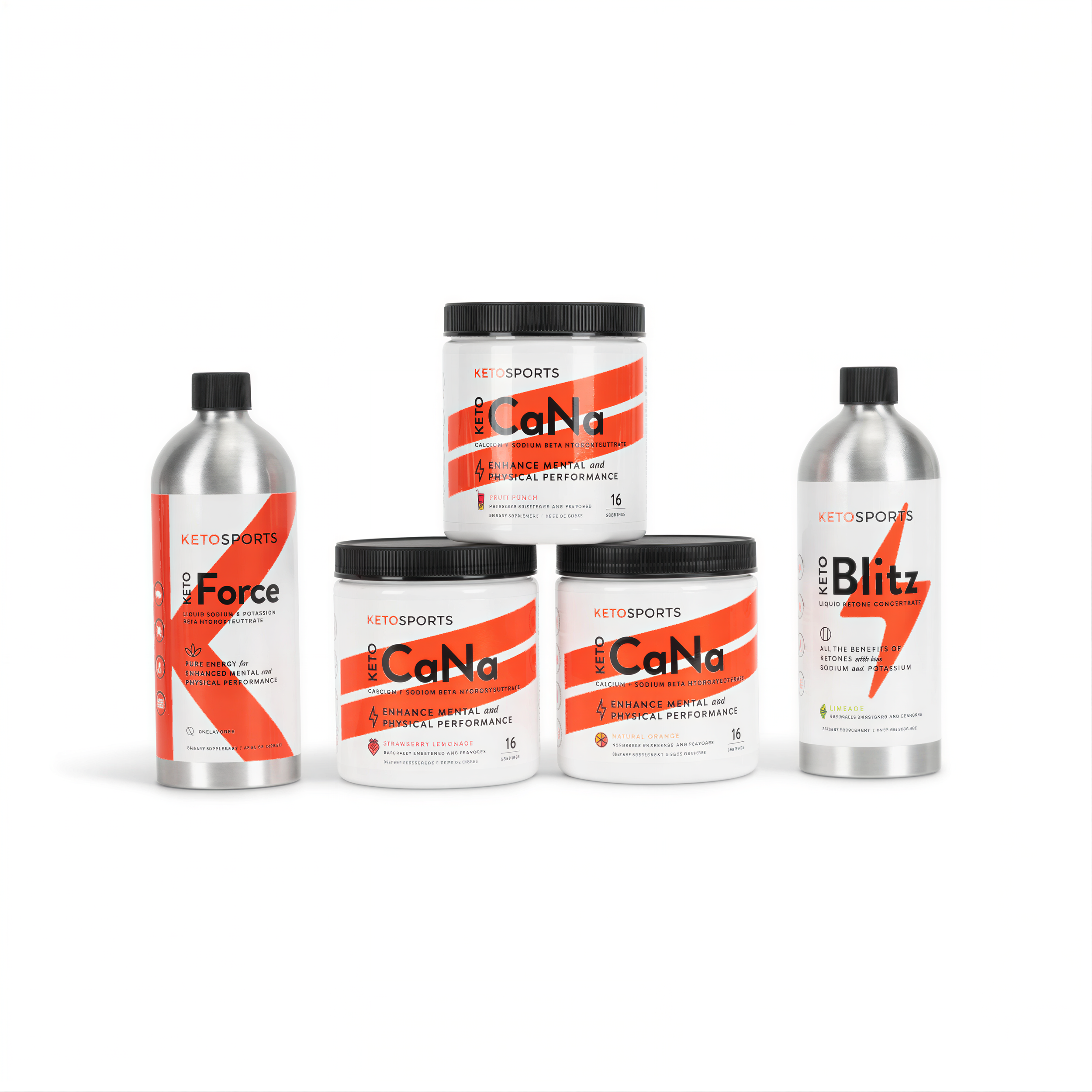
Since 2012, KetoSports has been a leader in ketone supplementation. KetoSports had a loyal following and a product that worked — what they needed was branding that worked just as hard. The rebrand and packaging redesign focused on positioning them as the authority in ketone nutrition, moving away from a generic supplement aesthetic toward something bold, clean, and science-backed. New packaging design unified the product family, with clear hierarchy, stronger on-shelf impact, and a look that earns trust at first glance.

stateside manufacturing and production

(Please note: I receive no reciprocation for your patronage of the client’s site)